The biggest challenge in climate communication isn’t just the complexity of the science — it’s that many of the most pressing issues and solutions are invisible.
Carbon dioxide? You can’t see it. Methane leaks? Colorless and odorless. A company’s carbon reduction efforts? Buried in a sustainability report no one reads.
If your customers, investors, or policymakers can’t picture the (current or potential) impact of your work, they won’t remember it, trust it, or be inspired by it. Plastic pollution and oil spills have both driven more environmental action than everyday carbon dioxide emissions because people can see them.
"You can spend all your resources documenting damage, but we're in a space where we need to link these things together and start thinking about the stories in a more meaningful way."
— Caitlin Ochs, Environmental PhotographerFor businesses and entrepreneurs working on climate solutions, what isn’t seen doesn’t drive action.
The human brain is hardwired to understand visuals. The majority of climate stories are depicted through scenes of damage, with few visual narratives showing ways forward. If you can’t visualize it, you can’t build it.
This is where visual storytelling becomes a game-changer. The right image, map, or interactive tool can turn abstract data into something tangible, technical progress into something relatable, and hidden impacts into something undeniable.
Why Visuals Matters for Climate Businesses
The human brain processes images 60,000 times faster than text, and visuals are the only universal human language. Neuroscientists have found that people remember only 10% of text-only information they read, but 65% when paired with an image!
Visual storytelling has driven real-world change, from urban tree-planting initiatives sparked by heat maps to billion-dollar investments in clean energy after compelling satellite imagery exposed environmental risks.
Businesses, too, have leveraged visual storytelling for real impact. For example, Groundtruth, a sustainable luggage company, uses strong visuals and even documentary filmmaking to drive awareness about its sustainability mission.
For climate businesses, great visuals can mean:
✅ Investors are more likely to remember and trust your solution and impact
✅ Customers can better connect with your mission
✅ Policymakers can visualize how your work helps their constituents
✅ Employees feel more engaged and inspired
The rest of this article explores how you can use visual storytelling to turn your climate impact into something people can see, feel, and believe.
1. The Power of Photography: Climate Proof in a Single Image
Photography remains one of the most effective ways to show, not tell when it comes to climate impact. The best climate photography doesn’t just document — it tells a story.
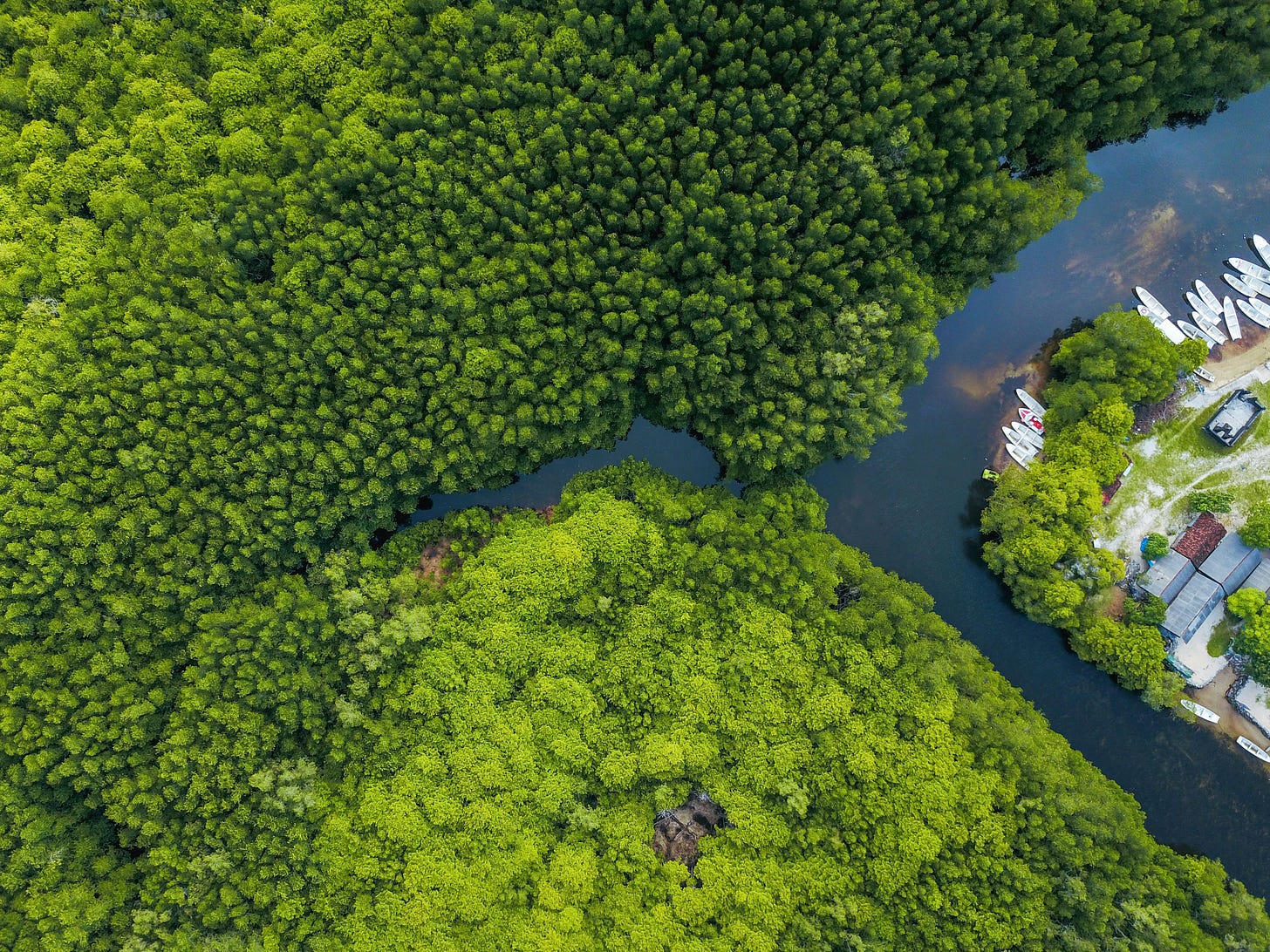
🔹 Nature-Based solutions are often beautifully highlighted with photography, such as Alex Cao’s stunning images of mangrove forests in Vietnam, shot for the Green Climate Fund.
🔹 Urban Heat Disparity & Policy Change: The LA Times used heat maps to expose stark differences in tree cover between wealthy and low-income neighborhoods, leading to new tree-planting policies in underserved areas.
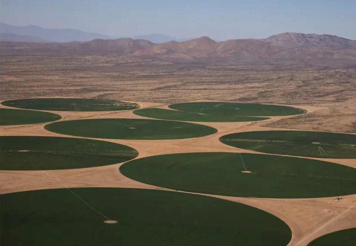
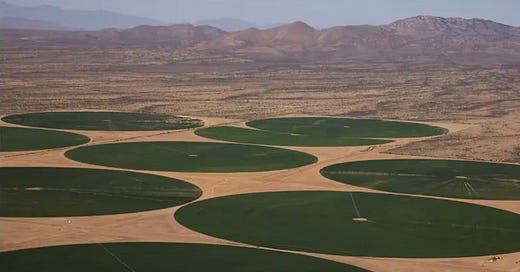
🔹 Water Scarcity & Business Impact: Photographer Caitlin Ochs’ work on the Colorado River Basin drought (see above) connects climate change to real-world economic losses, from failing crops to shrinking water supplies for major cities.
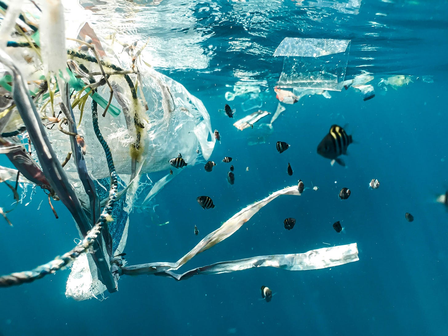
🔹 Images plastic-choked rivers and beaches have prompted lawsuits against plastic pollution in California and New York, and led to a ban of single-use bags in many states. While it’s often used as a meme, a poignant photo of a turtle with a plastic straw sparked a years-long movement by Lonely Whale against maritime plastic.
What Businesses Can Do
Invest in professional photography to document your environmental impact. This includes showing how something works, the way that it is made, and how you connect with communities. This does NOT mean using generic stock images or pictures of polar bears.
If this sounds hard, consider that professional photographers have trained for years to conceptualize topics on behalf of organizations and the public. They can help come up with an approach that suits your goals and audience.
The advertising industry invests millions of dollars in high quality imagery, in everything from commercials to packaging, which shapes how we view the world. The same approach can — and should — be taken by climate-minded organizations.
Here are a few quick ideas to get you started:
Show what influenced your founders — what was the initial problem, and how did you solve it?
Show customers using and enjoying your product
Show the impact that your product has had on communities
Show your founders at work
Show the scientific research underway, or field partners at work
Show before-and-after images of climate solutions in action
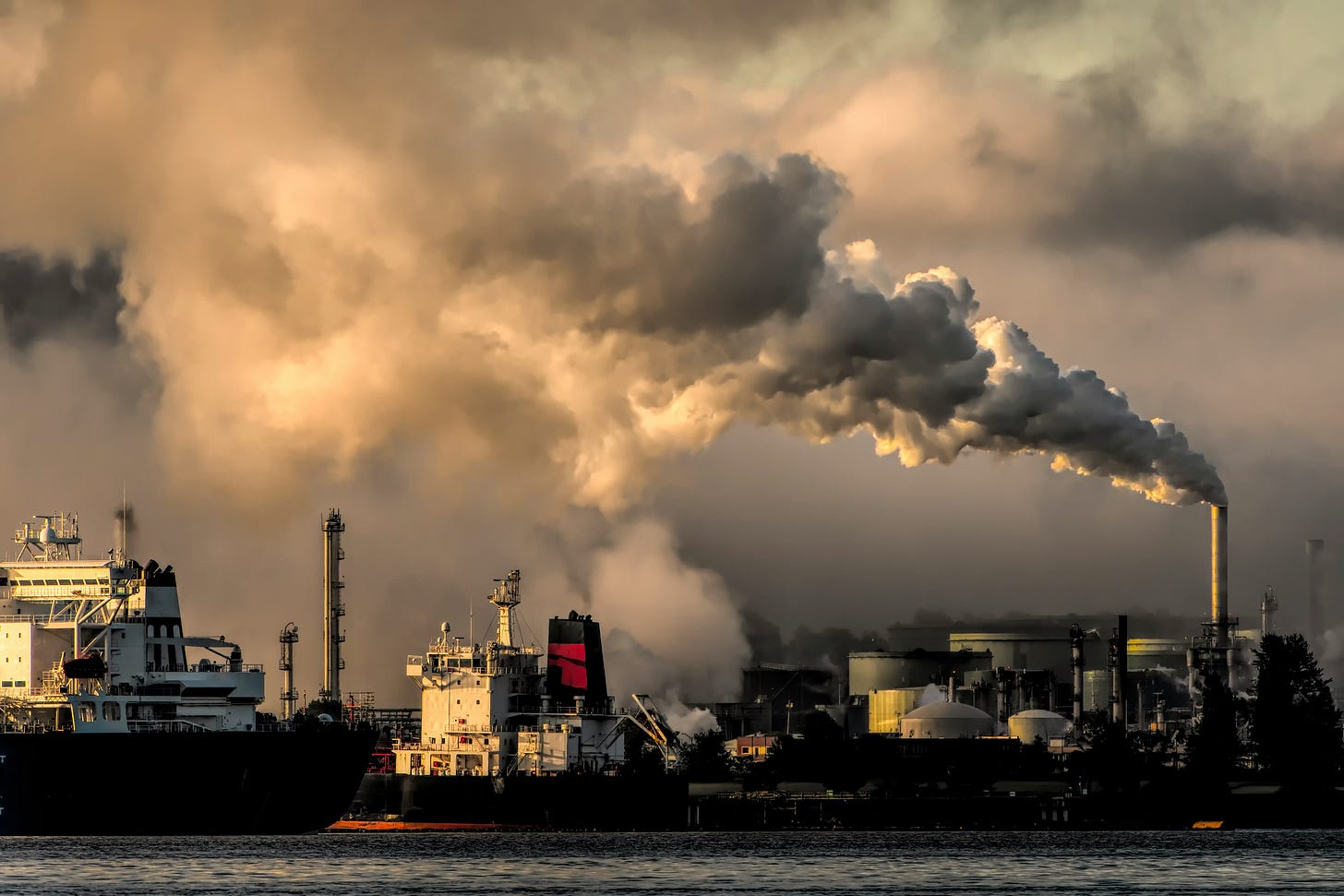
But what about the climate impacts and experiences that can’t be captured with a camera? This is where art and illustration come in.
2. Illustration & Art for Climate Communication
While photography captures reality, other forms of art help us visualize the unseen and imagine the future.
From the intangible experience of extreme heat to the abstract complexities of climate policy, artists help translate these issues into emotional, memorable visuals that resonate.
While photography captures reality, other forms of art help us visualize the unseen and imagine the future.
From the intangible experience of extreme heat to the abstract complexities of climate policy, artists help translate these issues into emotional, memorable visuals that resonate.
Expressing personal and collective climate experiences
Experiential phenomena that lack concrete visual representations — such as the subtleties of pain, displacement, or hope — can be brought to life through artistic expression. The pharmaceutical industry has excelled at this, by visualizing what pain feels like or how a medication works. The same approach can be applied to heat, drought and other impacts.
Making scientific concepts accessible
Abstract or highly technical subjects can be illustrated in ways that are engaging and understandable. Schematic drawings, how-to guides and simple storyboards can explain a process. Renowned business consultant Simon Bowen, for example, hand draws conceptual models to make complex ideas not only clear, but persuasive.
Imagining alternative futures
Art can depict solutions, not just problems, offering a hopeful vision of what’s possible. Building developers and urban planners can include depictions of green spaces, electric chargers, native plants and better built environments to normalize these features.
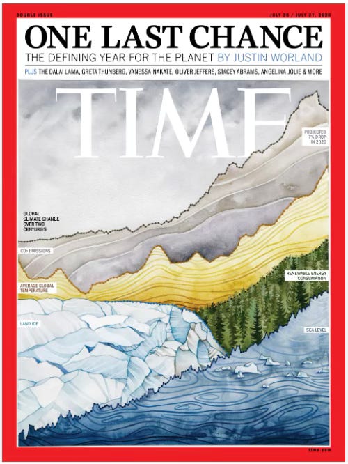
Art and illustration help us feel climate impacts and make the emotional case for climate action. But for investors, policymakers, and technical audiences, businesses must also make the analytical case — and that’s where great data visualization comes in.
3. The Art of Data: How to Make Climate Numbers Click
Numbers alone rarely inspire action. The way that they’re presented makes all the difference. The best climate data visualizations don’t just inform—they tell a story that sticks.
What Makes a Great Climate Data Visualization?
Simple but not simplistic: Line graphs for trends, bar charts for comparisons, heat maps for disparities. Your data should be clearly readable at a glance. People should not have to struggle to understand the data that you are presenting. It should have a clear title and intention.
Color with intention: Green for growth, red for risk, neutral tones for balance. Make sure that the graphs work in grayscale too.
Contextualized information: “50% emissions reduction” is meaningless unless compared to industry norms or other forms of technology. Give context, background and comparisons to make your numbers mean something. Whenever possible relate the data to easily understood scales — a metric ton is hard to imagine, this comparison makes it easy.
Interactive when possible: Zoomable maps, hover effects, adjustable timelines — let people explore the data on their own, because it helps numbers stick in memories.
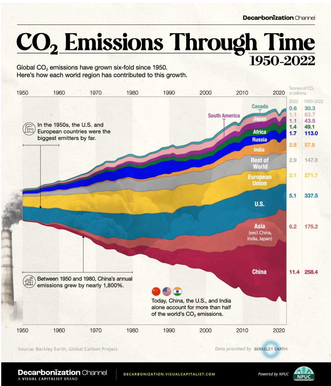
Real-World Examples of Businesses Using Data Visualization
Carbon Tracking Startups like Terralytiq use dynamic dashboards to help companies track and visualize their emissions reductions.
Food Sustainability Companies like HowGood use product lifecycle analysis visuals to show how food choices impact the climate, making sustainability actionable for brands.
Building & Energy Firms use before-and-after energy efficiency heat maps to prove impact to clients and policymakers.
What Businesses Can Do
Turn your internal climate data into visuals for investor decks, reports, and marketing
Use interactive tools to help stakeholders engage with your impact. Datawrapper and Tableau both have intuitive tools that are readily available to use.
Avoid overwhelming people with raw numbers—show trends in a way they can grasp
Data visualizations help reveal patterns, but some of the most powerful visuals in climate communication come from entirely new perspectives — satellite imagery, augmented reality, and digital art.
4. Tools and Resources to Bring Climate Impact to Life
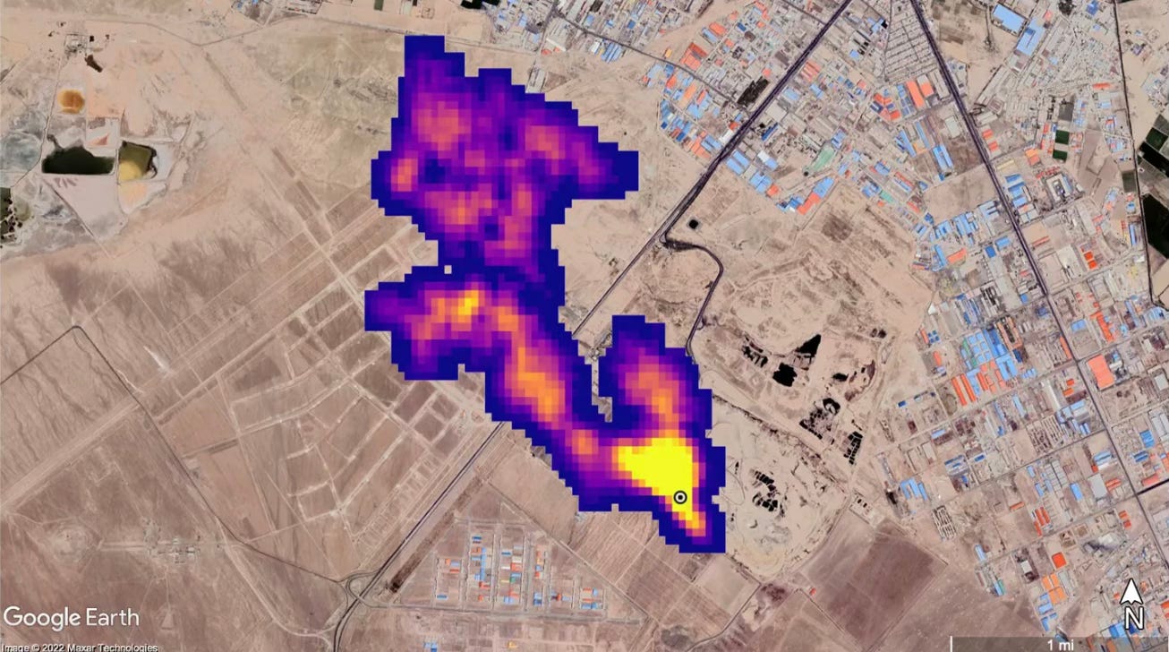
Many of the most important climate impacts and solutions are happening out of sight. But today, we have better tools than ever to make the unseen visible.
Satellite Imagery & Remote Sensing
Carbon Mapper’s methane leak detection makes invisible pollution visible, forcing accountability on major polluters.
Global Forest Watch’s deforestation tracking helps businesses ensure supply chain transparency.
NASA’s temperature anomaly maps show real-time climate trends, helping investors and policymakers assess risk.
Augmented & Virtual Reality (AR/VR)
AR experiences let consumers see projected sea level rise in their own neighborhoods.
VR allows for immersive storytelling, from walking through a future solar-powered city to witnessing deforestation firsthand.
Climate startups are integrating AR/VR into sustainability education, advocacy, and marketing.
Now that we've looked at some approaches to visual storytelling, let's put it together for impact...
Make People See It, Feel It, and Believe It
If you want people to act on climate, you need to make them see it. Visual storytelling isn’t just a marketing tool—it’s a business strategy for impact. Audit your current communications and make note of where something could be more compelling Visuals should be included in reports and investor decks, along with public-facing social media and websites.
👉 What climate visuals have inspired you the most? Let’s talk in the comments.





Great article David. As a designer and illustrator though, I'm biased. 😉 Visuals will always be powerful tools.
I'd love to share a couple examples I've been inspired by.
While working with a new client recently (glaciologists!), I was introduced to an interactive map showing global air currents, wave patterns, water temperature, etc. It's been a helpful tool to better understand where most of the ocean warming and glacial melting is occurring on Earth.
>>> https://earth.nullschool.net/#current/particulates/surface/level/overlay=pm2.5/orthographic=-3.07,-95.17,738/loc=-125.314,40.562
This article by the Guardian (though a few years old) is a great example of a mixture of storytelling via interactive visualizations AND photography.
>>> https://www.theguardian.com/us-news/ng-interactive/2017/dec/20/bussed-out-america-moves-homeless-people-country-study